
What Is the Efficient Frontier?
Markowitz’s great insight was that the relevant information about securities can be summarized by three measures: the mean return (taken as the arithmetic mean), the standard deviation of the returns and the correlation with other assets’ returns. The mean and the standard deviation can be used to plot the relative risk and return of any selection of securities.
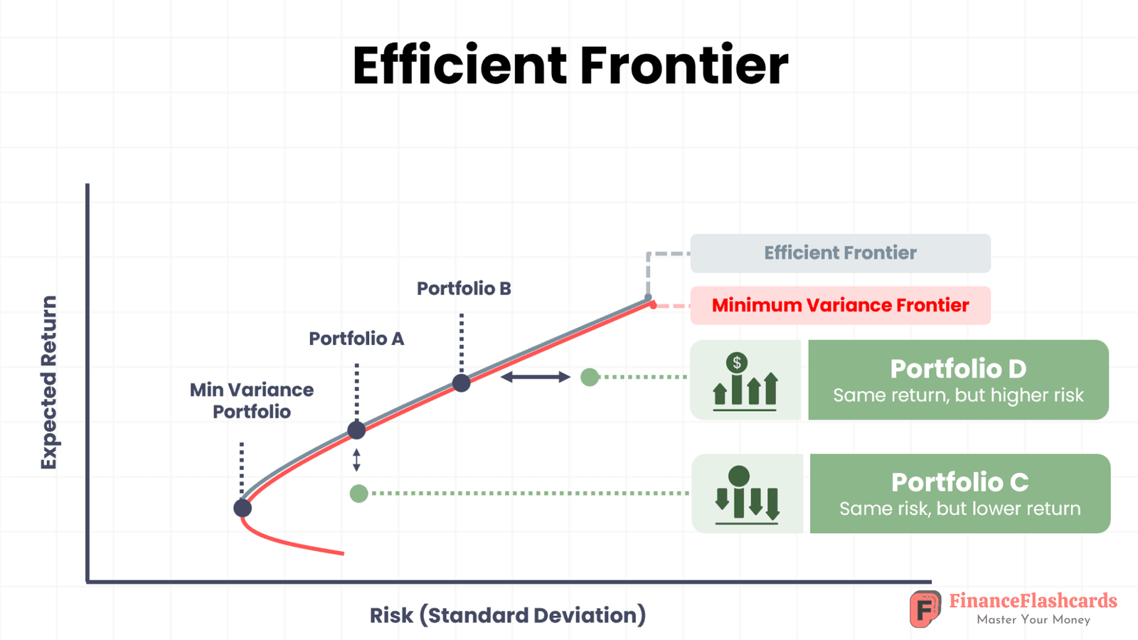
The efficient frontier represents portfolios offering the highest expected return for a given risk, or the lowest risk for a given return. It is a curved line on a risk and return chart, where the x-axis is represents the level of risk (as measured by the standard deviation of asset returns) and the y-axis is the expected return.
How Does an Efficient Frontier Work?
To understand the efficient frontier , we need to plot all the portfolios that we want to explore on a risk-return graph. Below is an example, in which each point represents a different mix of assets. As we can see, portfolios A and B are offer better returns than portfolios C and D respectively, because offer more attractive expected return for the same level of risk, or lower risk for the same expected return. The efficient frontier contains of all portfolios of risky assets that a risk-averse investor will choose, depending on their investment objective and risk tolerance profile. Rational investors will not choose any portfolio that is positioned below the curve (in this case, these are portfolios C and D).
A Live Example: Building an Efficient Frontier
To understand how the Efficient Frontier works in practice, let’s build a two-asset portfolio using Reliance Industries and Tata Motors.
The dataset contains monthly prices from August 2019 to July 2024. Here is how we turn that raw data into an Efficient Frontier.
1. From Prices to Monthly Returns
We first take the adjusted closing price of each stock and calculate how much it changed from one month to the next.
For example, if Reliance’s price increases from ₹1,118.64 to ₹1,200.79, that represents a 7.34% monthly return.
We repeat this process for every month, giving us 59 monthly return observations for each stock.
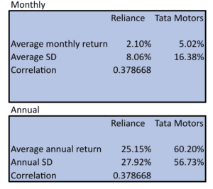
The average monthly return from the data is:
- Reliance: 2.10%
- Tata Motors: 5.02%
Tata Motors therefore generated the higher average return, but return alone doesn’t tell us which stock is better.
2. Measuring Volatility
Next, we look at how much these monthly returns fluctuate around their average. This gives us the standard deviation, which we use as our measure of risk.
The results are:
- Reliance: 8.06% monthly volatility
- Tata Motors: 16.38% monthly volatility
So, Tata Motors has produced higher returns, but its returns have also fluctuated much more.
To make the numbers comparable on an annual basis, the monthly figures are annualised:
| Reliance | Tata Motors | |
|---|---|---|
| Annualised return | 25.15% | 60.20% |
| Annualised risk | 27.92% | 56.73% |
3. Why Correlation Matters
The next step is to understand how the two stocks move relative to each other.
Using the monthly returns, we calculate their correlation.
The correlation in our dataset is 0.3787.
This is important because the two stocks don’t move perfectly together. When one stock moves, the other does not necessarily move by the same amount or in the same direction.
This difference creates a diversification benefit.
That is the key reason why combining assets can sometimes produce a better risk-return profile than holding either asset individually.
4. Creating Different Portfolio Weights
Now we start creating different combinations of Reliance and Tata Motors.
For example:
- 100% Reliance + 0% Tata Motors
- 75% Reliance + 25% Tata Motors
- 50% Reliance + 50% Tata Motors
- 25% Reliance + 75% Tata Motors
- 0% Reliance + 100% Tata Motors
For each combination, Excel calculates the portfolio’s expected return and risk.
The model also allows weights above 100% and negative weights. For example, 150% Reliance and -50% Tata Motors represents a portfolio that is effectively leveraged long Reliance and short Tata Motors.
5. Finding the Highest Sharpe Ratio
Once we have hundreds of different portfolio combinations, we need a way to identify which one offers the best risk-adjusted return.
This is where the Sharpe ratio comes in.
We use a risk-free rate of 6.56% and calculate the Sharpe ratio for every portfolio.
The logic is simple:
Which portfolio gives me the most return above the risk-free rate for each unit of risk I take?

The portfolio with the highest Sharpe ratio wins.
In our dataset, the highest Sharpe ratio occurs at approximately:
47% Reliance + 53% Tata Motors
This portfolio has:
- Portfolio return: 43.73%
- Portfolio risk: 37.08%
- Sharpe ratio: 1.0024
The 47%–53% allocation isn’t a magic number. It is simply the result of testing different combinations and finding the one that provides the best return relative to the risk taken, given our historical data.
6. The Final Picture
When we plot the risk and return of all these portfolio combinations, we get the portfolio opportunity set.
The portfolios that provide the highest possible return for each level of risk form the Efficient Frontier. Download the full model here
Our highest-Sharpe portfolio sits at the point where the risk-adjusted trade-off is most attractive.
The important takeaway is that portfolio construction isn’t just about picking the stock with the highest return.
Tata Motors had the higher historical return, but also significantly higher risk. Reliance had lower returns and lower risk. Because their returns were not perfectly correlated, combining them created a diversification benefit.
That is the fundamental idea behind the Efficient Frontier:
The right combination of assets can potentially create a better risk-return profile than simply choosing the asset with the highest return.
Important Note
These results are based on historical data. The 47% Reliance and 53% Tata Motors allocation is optimal for this particular dataset and these assumptions. It should not be interpreted as a prediction of future performance or as an investment recommendation.
